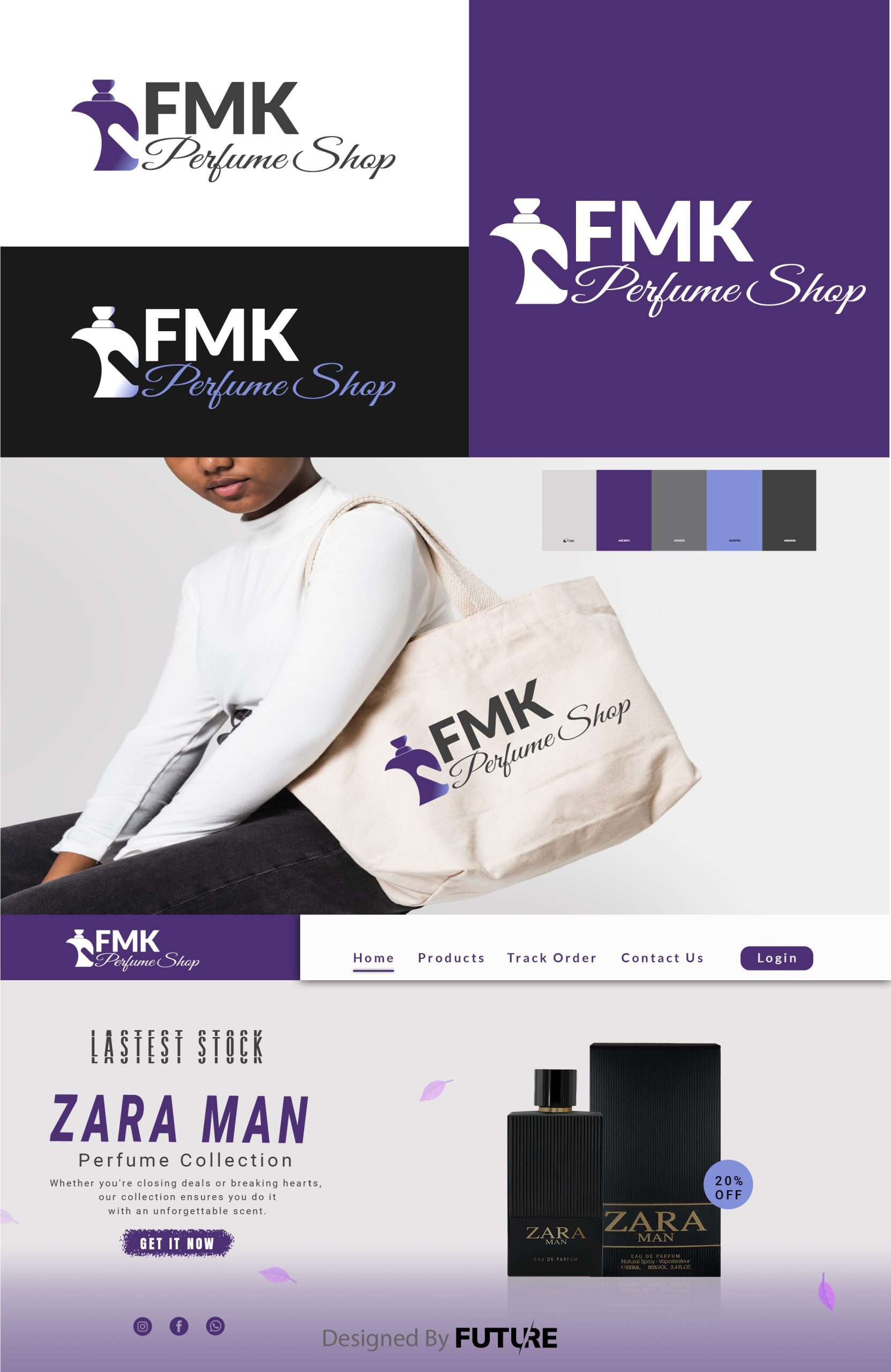
The Essence of Scent Visualized
On the journey to redesign the logo for FMK Perfume Shop, my aim was to encapsulate the ethereal nature of fragrance into a visual emblem.
Perfume isn't just a product; it's an experience, an invisible accessory, a personal signature.
Design Philosophy:
I drew inspiration from the art of perfumery itself – where each note in a fragrance tells part of a story. Similarly, every element of the new logo was chosen to narrate the essence of FMK:
-The Bottle Icon: Central to the design, the sleek, stylized perfume bottle serves not only as an icon of the industry but also symbolizes the vessel from which dreams and memories are poured. The bottle's minimalistic form suggests sophistication and the modern touch FMK brings to the art of perfume.
- Typography: The font chosen for "FMK" is elegant yet bold, evoking a sense of classic luxury with a contemporary twist. The letters are spaced to give a feeling of airiness, like a scent wafting through the air.
- Color Palette: Subtle gradients from clear to a strong purple were used, reflecting the liquid inside a perfume bottle, transitioning from transparency (the pure essence of scent) to gold (the value and warmth of the personal touch FMK adds to each fragrance).
- Integration: The seamless blend of the bottle icon with the letters 'FMK' suggests unity and completeness, much like how a perfume completes an outfit or mood. The icon subtly fuses with the 'F', symbolizing how integral the fragrance is to the brand's identity.
The Impact:
This redesign was not merely about aesthetics; it was about breathing life into FMK's brand, making it visually resonate with the luxurious, intimate, and personal experience of choosing a perfume. The logo now invites customers into the world of FMK, promising them not just a scent, but an olfactory journey tailored just for them.


